Creating a Grouped Command Control
Scenario: You want to change the units of an Analog Input point by selecting a value from a dropdown command control, and then clicking Send.
There are two methods of doing this:
- You can gather object type information for a data point and then draw and configure a customized command symbol or graphical element, such as a button, that allows you to send commands from within a graphic.
- You can drag an existing default command symbol from a project library to a graphic. To add a default command symbol from a project library, proceed directly to Designating and Adding a Default Command Symbol to a Graphic.
Reference:
- For overall background information, see Command Control Configuration.
- For Command Control and Navigation properties background information, see Command Control Properties and Command and Navigation Properties.
- For symbols background support when creating command control symbols, see Symbol Property Substitution.
Workflow diagram:
Prerequisites:
- You have reviewed Preparing to Create Controls to Command Objects
- System Manager is in Engineering mode.
Steps:
To draw and configure the Grouped command control, complete the procedures in order:
This is just one example of how to draw and combine multiple command controls to create a Grouped command control.
- You have reviewed or completed the Preparing to Create Controls to Command Objects workflow.
- You have reviewed the Command and Navigation Properties and have a full understanding of the fields and the options available to you.
- To create a new command control on the graphic, from the File menu, select New Graphic
 .
.
- To draw the dropdown command control, do the following:
- Click Command Control
 , and draw a rectangular shape on the canvas.
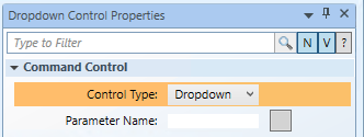
- From the Property View (Command Control Properties) expand the Command Control properties, and from the Control Type drop-down menu, select Dropdown.

- In the Parameter Name field, type the data point’s Parameter name obtained from the Models and Functions Command Configuration table. This field is case–sensitive. This property will be the same Parameter property later defined in the Group’s Command and Navigation section.
- For this example, type: Value.
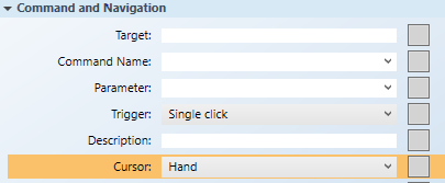
- With the dropdown command still active on the canvas, navigate to the Command and Navigation property, from the Cursor drop-down menu, select the cursor type you want to display when the mouse is placed over the command control in runtime mode.

- NOTE: The cursor must be set for each child element or command control of the parent, which is the Group command, but not at the Group level.
- Leave all the other Command and Navigation properties, as is.
- To draw the Send button, do the following:
- Click the Text
 element, and draw a text element on the canvas.
- From the Property View (Text Properties) in the Text field, highlight
Textand then type Send.
- Expand the Command and Navigation properties, and select the Command Trigger check box. This allows the Send button to be the command trigger that initiates the command.
- From the Trigger drop-down menu, select how to initiate the command: Single click or Double click.

- To format the Send element, from the Property view (Text Properties), expand the Colors property. Format the Send button using the following properties.
- Background: Type the name of a color for the background.
- Stroke: Type a name of a color for the text characters.
- To create the Group command control:
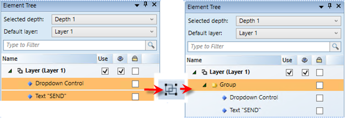
- Navigate to the Element Tree view, select Dropdown Control and hold down the CTRL key and then select Text „SEND“.
- In the Home tab, Selection group, click Group
 .
.
- Text “SEND” and Dropdown Control are now children of the Group.

Scenario: You want to change the units of an Analog Input point, by selecting a value from a dropdown control, and then clicking Send.

NOTE:
If you create a command control element in a symbol instead of on a graphic, follow the steps below, replacing the target and any other hard-coded references with * substitutions in the Evaluation Editor. For more information, see Symbol Property Substitutions.
- You have reviewed the properties in the Command and Navigation Properties group and have a full understanding of the fields and the options available to you for configuring the Command and Navigation properties.
- You have drawn a dropdown control and a Send button (Text element), configured their Command and Navigation properties, and grouped them.
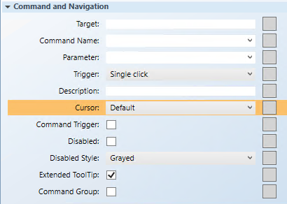
- Select the Group control on the canvas, and from the Property view (Group Properties) expand the Command and Navigation properties group.

- In the Target field, drag the data point from System Browser that is the object receiving the command. If the target’s designation path does not specify a property, the default property is targeted. You can also specify the property by typing the [.Property_Name] after dragging the data point into the Target field.
- For this example, drag the Analog Input data point and at the end of the path, type
.Units. The Target path should display xSystem1.ManagementView.[custom path].AI_1;.Units.
NOTE: If you have the data point selected in System Browser, or you have selected a symbol instance of the data point on the canvas, the data point information is displayed in the Extended Operations tab, from there, drag the property you want to target into the Target field. The property name is added automatically.
- From the Command Name drop-down menu, select or type the command name that you want applied to the property. The command name must match the name of the command in the Models and Functions Command Configuration section. This field is case-sensitive.
- For this example, type Write.
- In the Parameter field, do one of the following:
- Select the value from the drop-down menu.
NOTE: For a stand-alone command control, if you have multiple parameters, only one parameter receives the value from the control itself and all other parameter values must be hard-coded.
- For this example, delete everything but the parameter name, which in this case is: Value.
- You have already configured the trigger for the Group command in the Send (Text element) button Command and Navigation properties section. Leave this field as is.
- (Optional) In the Description field, type a brief description of the command that will appear in the tooltip.
- From the Cursor drop-down menu, leave the default, as this field is not configured for the Group.
NOTE: In a Group command control, the children receive the cursor configuration only.
- Ensure the Command Trigger check box is not selected.
- The Extended Tooltip check box is selected by default. It displays the following command object details: Target, Command Name, and Parameter. If enabled, the extended tooltip is added to any existing tooltips configured for the element.
- Select the Command Group check box.

- Click Save As
 .
.
- If you created a symbol and you want to designate it as the default command symbol for an object type proceed to Designating and Adding a Default Command Symbol to a Graphic.
